Background
Avoid using backgrounds that distract your audience from your content or make the text difficult to read. It can be tempting to use photos as backgrounds. However, they can make it difficult to navigate the poster content. Think about whether your photo could be better used as a smaller, higher resolution image on your poster rather than a pixelated background. Photos can also have light and dark patches, which can make it difficult to have a consistent text colour that can be read easily across the whole poster.
The images below give you some examples of poor choices of background and some alternatives.
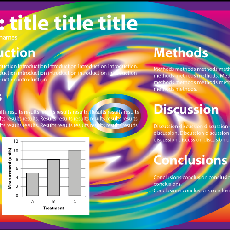
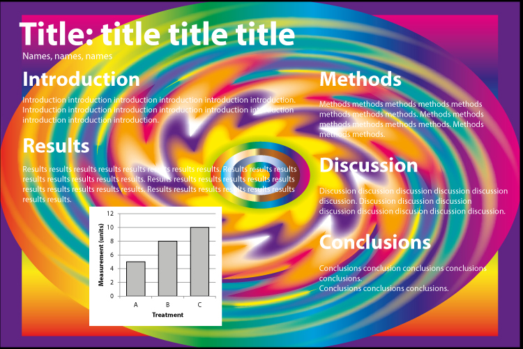
This background would certainly make your poster stand out, but is a bit overwhelming. There are a lot of colours and it is hard to read the text. The intensity of this background may make it hard for people to look at this poster for very long.
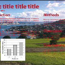
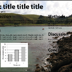
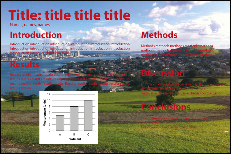
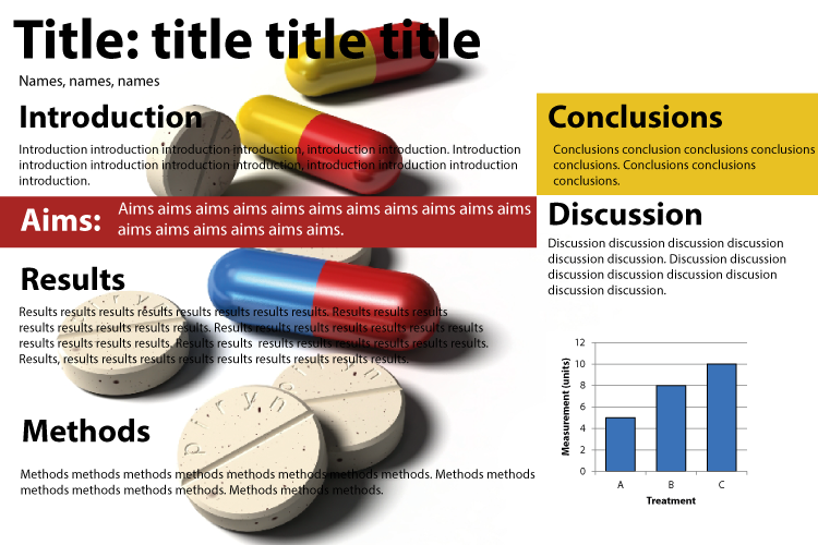
The photographic background has a lot of fine detail and different colours. The red text has been used to try to make the text stand out, but it is still difficult to read.
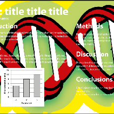
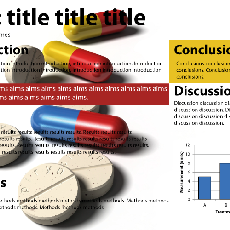
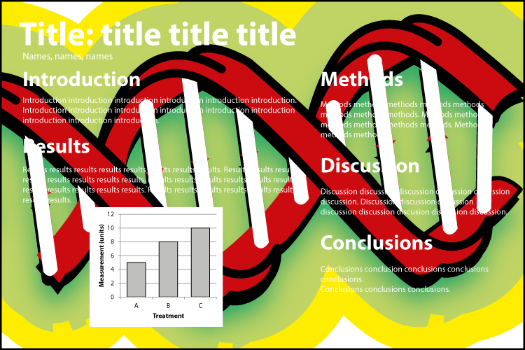
The white writing cannot be seen against the white parts of the illustration. This image dominates the content.
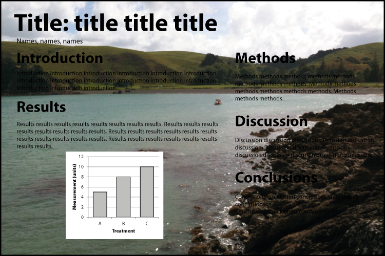
The white text can be read against the dark parts of the photograph, but the title and methods fade into the cloud background.
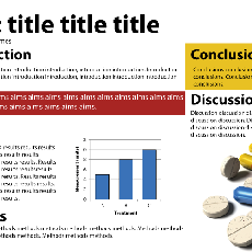
Using the black text make the title stand out, but now other sections are difficult to read or cannot be read at all.
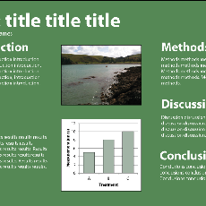
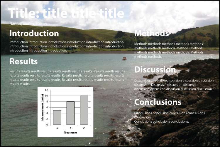
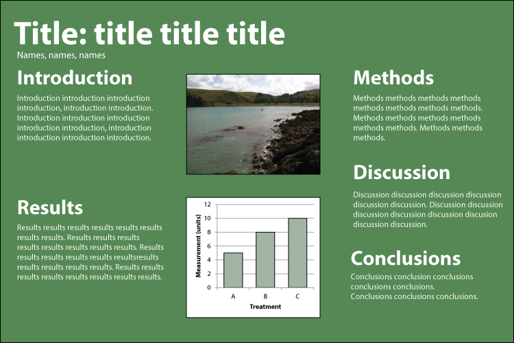
Rather than having the photograph as the background, another option is to include it as a smaller image instead.
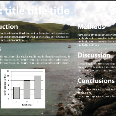
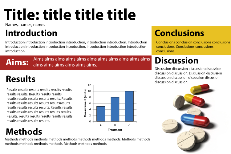
The colours used match the background picture, but again the light and dark elements of the picture make the text difficult to read in parts.
Having a smaller image to the side makes both the text and the image stand out. The image is still large enough to convey what the poster is about, but small enough that it doesn't overshadow the content.

")